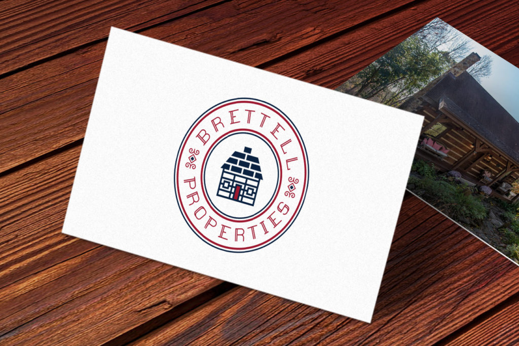
Brettell Properties manages a series of a popular getaway cabins in Hocking Hills and Indiana. The client approached me early in the business’s life for a logo to establish a name in the Midwest. The client loved French decor and the color red, two major elements that I worked into the design style.
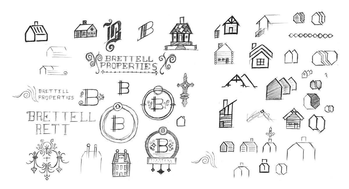
Sketches
Initial sketches were done while browsing photos of French architecture on Pinterest to acquaint myself with French design language. French design favors traditional and ornate styles with florals, so I knew a clean and modern mark in my typical style wouldn’t make sense here. Many of these sketches are of buildings I saw or decorative elements I found interesting.
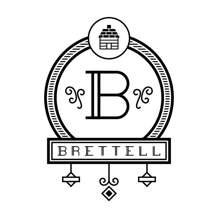
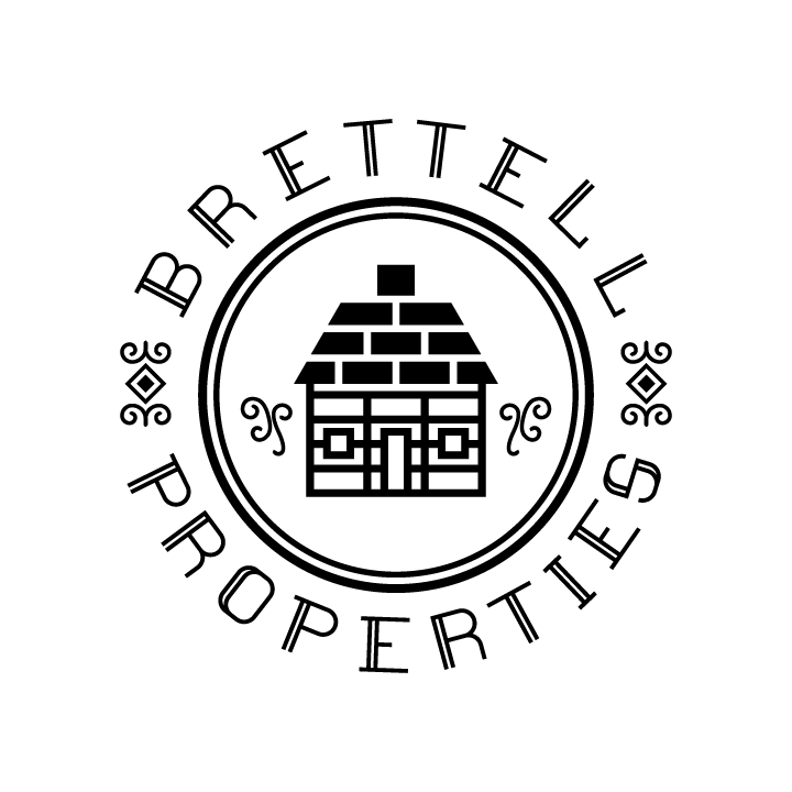
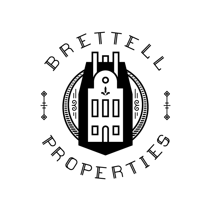
Comp Logos
As I started to hone the design style during the sketching process, I knew there were a few that I wanted to render fully in Illustrator to see what they looked like with the symmetry and precision tools of the software.
Refined Logos
These three logos were the ones I presented to the client.